If you’re entrenched in the world of Salesforce, either elbow-deep in code as a developer or brainstorming the next big UX breakthrough, you’ve likely encountered or at least heard of the Salesforce Lightning Design System (SLDS). But what truly is SLDS, and how can you leverage its full potential to craft engaging, dynamic user interfaces that stand out? Stick around as we dive deep into the essence of SLDS and explore practical strategies for harnessing its capabilities to elevate your Salesforce applications.
Introduction to Salesforce Lightning Design System (SLDS)
At its core, the Salesforce Lightning Design System is a framework built to provide developers and designers with a collection of design guidelines, standard practices, and resources. Its primary objective is to enable the creation of consistent and accessible applications within the Salesforce ecosystem. What sets SLDS apart is its focus on visual harmony and user experience, ensuring that applications not only function seamlessly but also look cohesive across various Salesforce platforms and devices.
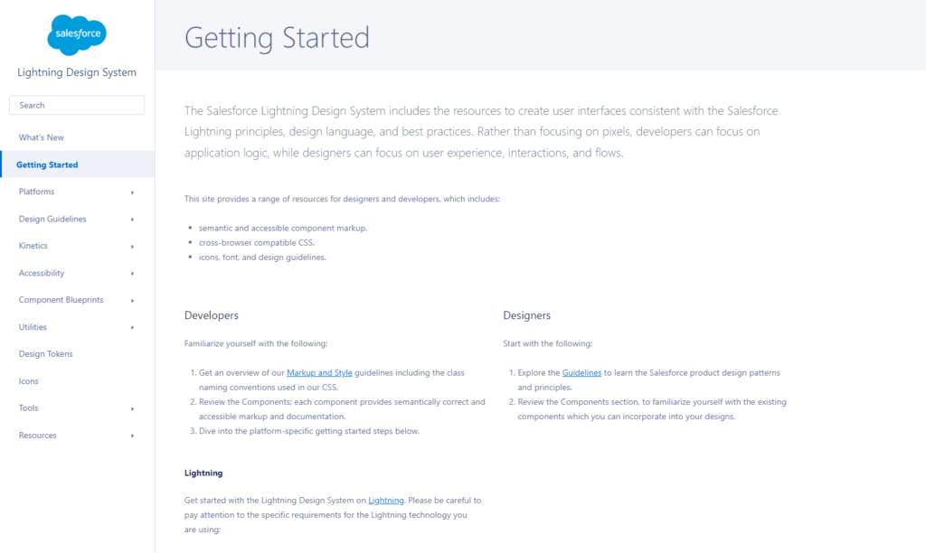
The SLDS encompasses a wide array of components, from typography and color palettes to interactive elements like buttons, icons, and forms. By adhering to the guidelines and utilizing the predefined components, developers and designers can significantly streamline their workflow, ensuring a standardized look and feel across applications, enhancing usability, and fostering a smoother user journey.
A Deep dive into SLDS
Understanding the Component Library
The Salesforce Lightning Design System offers a robust component library that serves as the building block for developing dynamic interfaces. These components are pre-built and pre-styled, meaning that they come ready to be implemented directly into your projects. Let’s explore some key aspects:
- Responsive Layouts: With the rise of mobile usage, creating responsive designs is non-negotiable. SLDS provides Grid systems and Flexbox utilities that make crafting adaptable layouts a breeze.
- Form Elements: Crafting forms is an integral part of developing user-centric applications. SLDS provides a variety of form elements, complete with validation styles and accessibility features, to enhance user interaction.
- Visualforce: For those working with Visualforce pages, SLDS ensures that integrating modern design into these pages is straightforward, bridging the gap between old and new Salesforce UI paradigms.
- Lightning Web Components :The Component Library for Salesforce Lightning Web Components (LWC) provides developers with a comprehensive toolkit built on the Salesforce Lightning Design System (SLDS). This library offers a rich collection of reusable UI components designed to streamline the development process and ensure consistency across Salesforce applications. Leveraging SLDS within LWC enables developers to create visually appealing, responsive, and accessible user interfaces that seamlessly integrate with the Salesforce ecosystem. Whether it’s buttons, forms, navigation elements, or complex data displays, the Component Library empowers developers to build intuitive and efficient user experiences while adhering to best practices and design standards. With its extensive documentation and easy-to-use features, the Component Library accelerates development cycles and enhances productivity for Salesforce LWC developers.
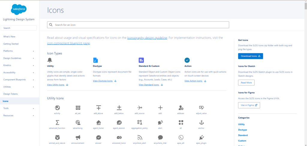
Leveraging Icons and Illustrations
One of the gems within the SLDS treasure trove is its exhaustive collection of icons and illustrations. These visual elements are not just decorative but play a crucial role in guiding users, conveying information, and adding a layer of interactivity to applications. When used judiciously, these elements can significantly enhance the user interface’s intuitiveness and aesthetic appeal.
Best Practices for Implementing SLDS
To truly tap into the potential of the Salesforce Lightning Design System, it’s imperative to follow certain best practices that not only facilitate a smoother development process but also result in more engaging and effective applications.
Consistency is Key
The essence of SLDS lies in its ability to foster consistency across applications. This consistency isn’t just about visual appeal but extends to how users interact with and perceive applications. By adhering to the design guidelines and utilizing the components judiciously, developers and designers can ensure a uniform experience that users find reliable and easy to navigate.
Prioritize Accessibility
Accessibility should never be an afterthought. The SLDS framework places a strong emphasis on creating interfaces that are accessible to all users, including those with disabilities. Leveraging the accessibility features and guidelines provided by SLDS not only broadens your application’s reach but also underscores your commitment to inclusivity.
Test, Iterate, and Collaborate
The development process is inherently iterative. As you integrate SLDS into your projects, continuous testing and feedback are vital. This iterative process, coupled with collaboration between developers and designers, ensures that the end product not only adheres to design standards but also meets the users’ needs effectively.
Advanced Tips for Mastering SLDS
Beyond the basics, mastering SLDS involves delving into its more nuanced capabilities and learning to adapt its components and resources to fit your unique project requirements. Here are a few tips to elevate your SLDS game:
- Customize with Sass: SLDS allows for customization using Sass (Syntactically Awesome Style Sheets), enabling you to tweak the design system to align with your brand guidelines while maintaining consistency with Salesforce’s design language.
- Leverage Utility Classes: Utility classes are a powerful feature within SLDS that allow for quick, inline modifications to layout, spacing, and more, without the need for custom CSS. These are invaluable for making swift adjustments that enhance the user interface.
- Stay Updated: The Salesforce ecosystem is continually evolving, and so is SLDS. Keeping abreast of the latest updates and features is crucial for leveraging new components and functionalities that can enrich your applications.
Conclusion: Lighting the Way with SLDS
The Salesforce Lightning Design System is more than just a set of guidelines and components; it’s a blueprint for constructing efficient, engaging, and aesthetically pleasing applications within the Salesforce ecosystem. Whether you’re a seasoned developer or a UI/UX designer embarking on your Salesforce journey, SLDS offers the tools and resources needed to craft applications that are not only functional but also delightful to interact with.