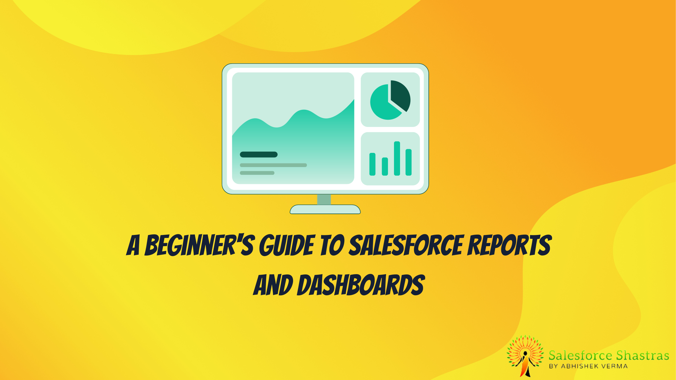
Do you find yourself swamped in a sea of data, struggling to extract meaningful insights? Welcome aboard the Salesforce Reports and Dashboards’ boat!. This guide marks the beginning of your journey towards streamlined analytics and impactful decision-making.
In this blog post, we will delve into the fundamentals of Salesforce Reports and Dashboards. We will explore their features, advantages, and provide a step-by-step guide to leverage them optimally. Understanding these tools can radically transform how you decipher your business data. So, let’s dive in!
Salesforce Reports: Telescope to the Data Universe
Let’s start by addressing the basics. Salesforce reports give you a consolidated view of your data, a telescope, if you will, to gaze into the data universe – summarizing insights, identifying trends, and offering a detailed analysis.

What Makes Salesforce Reports Unique?
- Customizability: Salesforce Reports can be tailored to address specific business needs. You have the autonomy to decide what data gets in and out. How cool is that?
- Real-time Access: As soon as there’s a data change, your report updates. It ensures that you’re always making decisions based on the most recent information.
- Simplicity: Creating a report in Salesforce is as simple as drag-and-drop. Yes, you heard it right!
Understanding Different Types of Salesforce Reports
You can create different types of reports in Salesforce based on your needs. Let’s cover some of the most commonly used ones:
- Tabular Reports: As straightforward as it gets, they display rows of data without any sorting or subtotals. It’s like the raw, unfiltered view of a starry night.
- Summary Reports: They add a layer of organization, grouping rows of data by a particular field. Think of it as a map separating constellations in the sky.
- Matrix Reports: These give a two-dimensional view, summarizing information based on both row and column groups, like a detailed star chart of the celestial sphere.
- Joined Reports: A bit advanced for beginners, but worth mentioning, they allow different views of data from multiple report types.
Remember: The choice of report type depends on the complexity and specifics of the data you wish to decipher.
“The right type of Salesforce report is like a stargazing guide, helping you navigate the data universe as effectively as possible.”
How to Create Salesforce Reports
- From your Salesforce interface, click on ‘Reports’ in the App Launcher.
- Click ‘New Report’.
- Select a Report Type according to your need.
- Add filters to narrow down the data you want to see.
- Add fields by dragging and dropping them into the report view area.
- Save your Report, and voila!
Remember, practice makes perfect. The more you experiment with these steps, the better you’ll get!
Salesforce Dashboards: Your Control Centre
Inspired by the numerous dials, switches and screens in a spaceship’s control centre, Salesforce dashboards represent multiple report summaries visually, giving an at-a-glance, infographic-esque view of your business data.

Elements of a Salesforce Dashboard
Peering into the dashboard, we will find:
- Components: The individual pieces of visual data on a dashboard, representing different reports. They can be charts, gauges, tables, metrics, or visual sitemaps – quite like the different controls on a spaceship.
- Dashboard Filters: They help you control the data that dashboard components display, helping focus on what matters. Consider them like the tuning dials on your telescope.
Why Salesforce Dashboards?
- Visual Appeal: Dashboards turn your data into engaging charts, graphs, and tables, making data interpretation more intuitive.
- Versatility: With Salesforce Dashboards, you can monitor various metrics simultaneously. It’s like keeping an eye on everything, yet missing nothing.
- Interactivity: These dashboards are not just static displays. You can interact with elements to dive deeper into specific metrics.
“Salesforce Dashboards: Your interactive, visual, and versatile business overview.”
Creating Salesforce Dashboards
- Click on ‘Dashboards’ in the App Launcher.
- Click ‘New Dashboard’.
- Add components to your Dashboard by selecting the corresponding reports.
- Customize each component (chart type, size, etc.).
- Save your Dashboard. Your business overview is now just a glance away!
No mastery occurs overnight, so don’t fret if your first dashboard isn’t perfect. Keep refining!
Making Use of Dashboard Layouts:
In Salesforce, you can customize dashboard layouts, adapting to your organization’s needs. Whether you need a 3-column layout housing loads of compact, quick-glance data, or prefer a more spread-out and detailed layout, Salesforce has you covered. It’s akin to having your spaceship dashboard, exactly how you want it.
“What a spaceship is to an astronaut, a well-structured Salesforce dashboard is to a business professional.”
Navigating through Reports and Dashboards
As a beginner, it is essential not only to understand the different types and components of Salesforce reports and dashboards but also to have a secure grip on navigating these powerful tools.
Here are some handy tips to navigate Salesforce reports and dashboards smoothly:
- Start Simple: Start with creating simple tabular reports or using pre-existing report templates. As you familiarize yourself, move to more complex types like Matrix or Joined Reports.
- Experiment: Try creating different types of components for a dashboard. Play around with gauge, funnel, scatter chart, among others.
- Use Filters: Filters help you sift through enormous amounts of data and focus on what’s essential. Make sure to get comfortable with using them.
While this article covers the basics and is perfect for beginners to start, there are far more features, type-specific details, and functionalities that Salesforce offers for both reports and dashboards. However, like staring directly into the sun, rolling it all out at once can be a bit overwhelming. Consider this your first trip into orbit. As you grow accustomed to the zero-gravity environment, we’ll delve deeper into space, tackling more complex asteroids of information.
Exploring Further
“To infinity and beyond!” – Buzz Lightyear
Okay, maybe not infinity, but there certainly is a lot beyond what we discussed today. Salesforce offers comprehensive documentation and tutorials that can readily assist you in your journey ahead.
Let us remember that every flight begins with a single step. You’ve taken your first step today by understanding the basics of Salesforce Reports and Dashboards and how they serve as essential tools to navigate your business data. So get your space suit on, pull your telescope out, and start exploring. Good luck on your mission, fellow space explorer!
Conclusion
As we prepare for touchdown, let’s recap our journey. We understand what Salesforce reports and dashboards are, the types of reports, the components of a dashboard, and some basic crash-landing avoidance tips when navigating through them. Salesforce reports and dashboards, being the twin stars guiding the journey, are your gateway into understanding how well your organization performs.
With this newfound knowledge, suit up, get on board your spaceship and set your course. The expanse of the Salesforce universe awaits your exploration.
P.S. Watch out for space rocks!